GCF Global Learning - Web UX design
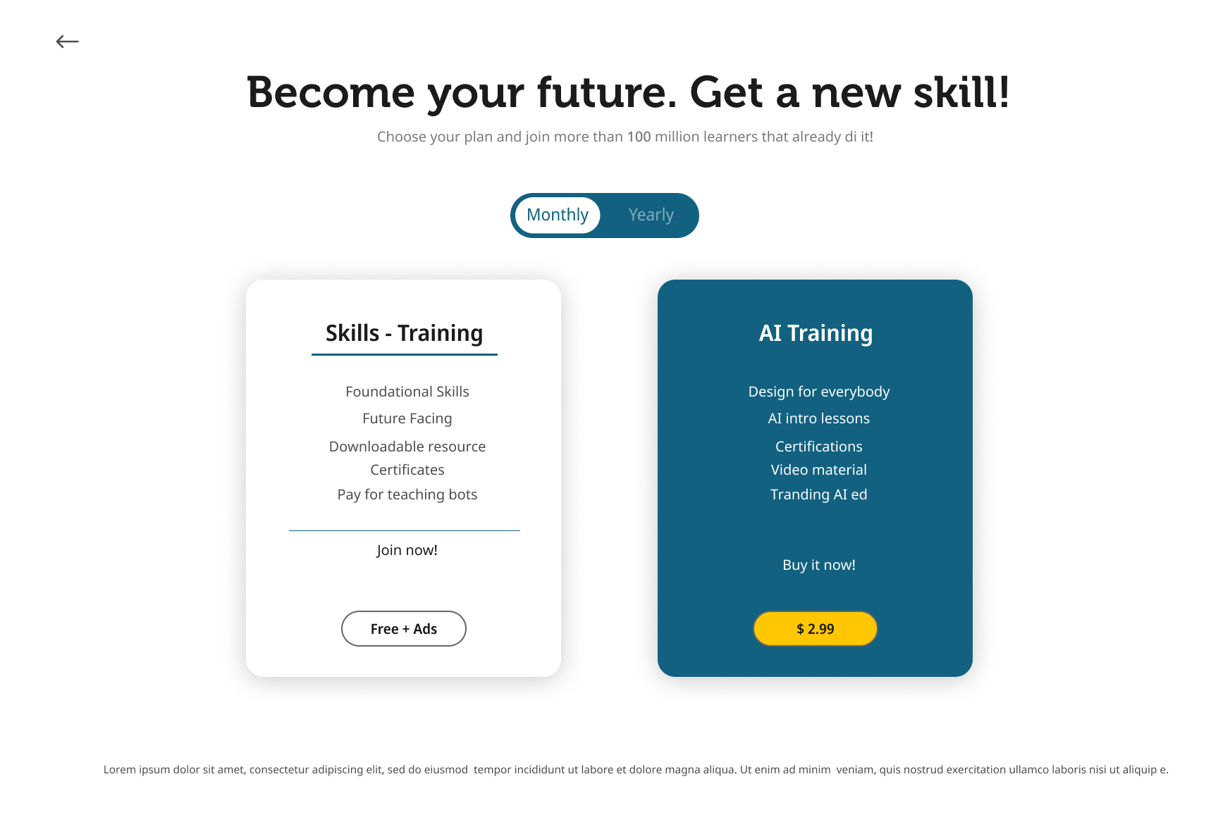
While working for GCF, I proposed a new website based on UX principles, utilizing existing data analytics for both the website and YouTube channel. The challange was to improve the current website and incress user engagment is vital areas of monotization.
Skills: UX motion design | Prototyping | UX Research | UI Design | Illustration | Communication | Design Systems | Web
Tools: After effects | Illustrator | Figma
Improving user interaction rate and monetization by integrating new home page and freemium options.
The product:
The GCF website offers free, low-skill level courses for English, Spanish, and Portuguese speakers worldwide.
The users:
The age group is between 18-44 years old for both men and women, with a majority of English-speaking users, followed by Spanish and Portuguese speakers.
Industry:
E-learning, Non-profit
The Challenge
Analyze the interconnection between a diverse pool of users on the YouTube channel and website lessons using three years of data analytics from 60 million visitors. Identify pain points and create a new website to improve user calls to action for donations and subscriptions.
Process
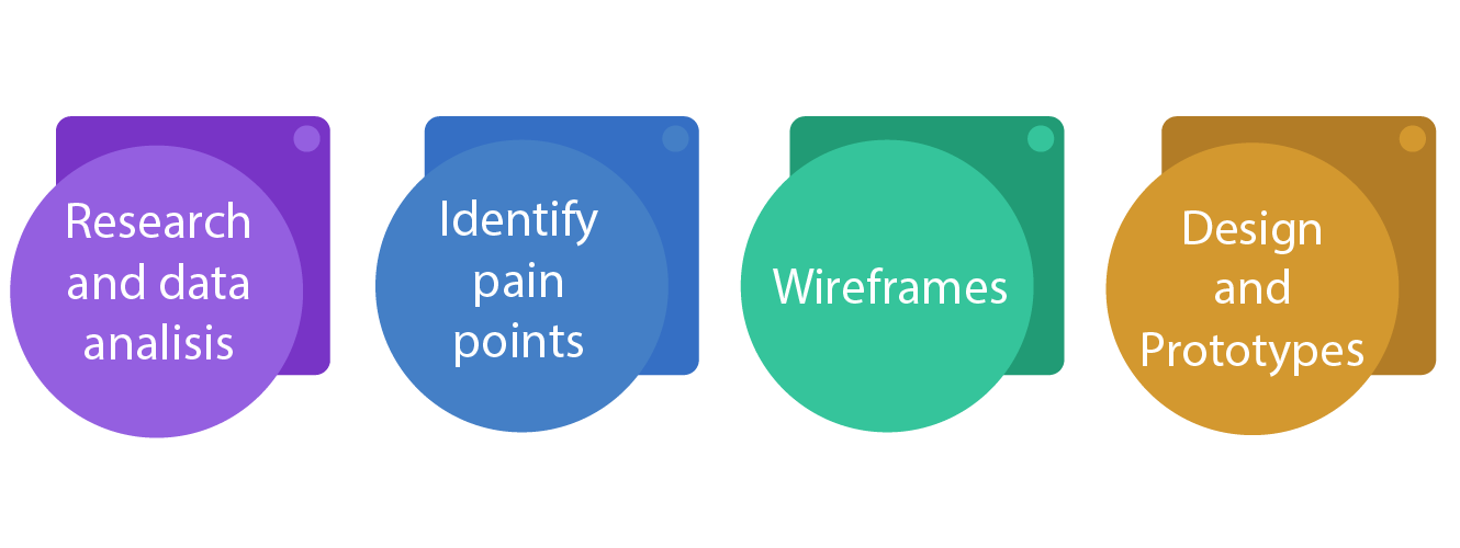
UX research and data analytics
I analyzed three years of Google Analytics data for the website, with an average of 60 million visitors each year. By examining user behavior, I identified potential issues such as low engagement among non-English speakers and high bounce rates on certain pages.
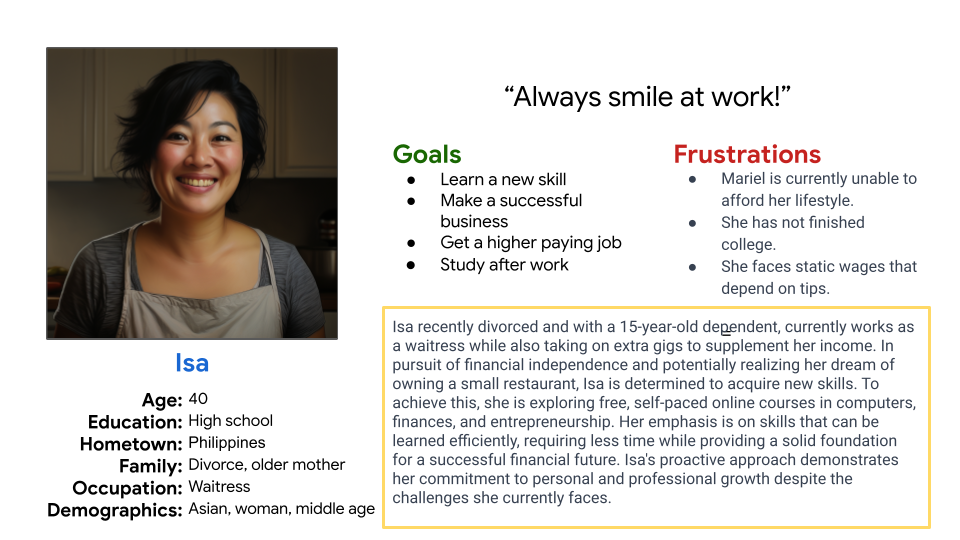
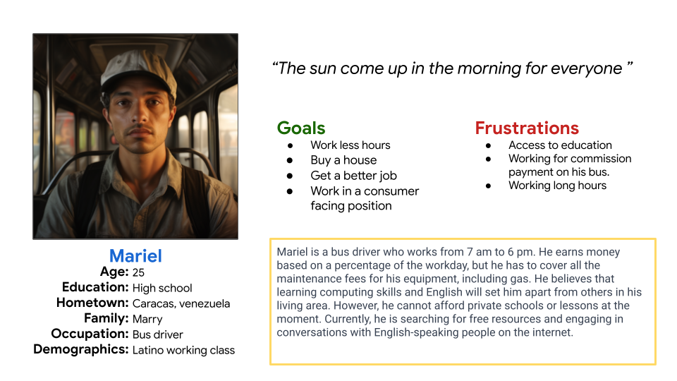
After creating personas for this project, I concluded that the main pain points are readability, clear calls to action, navigation issues, and a visually inviting page.
Website redesign


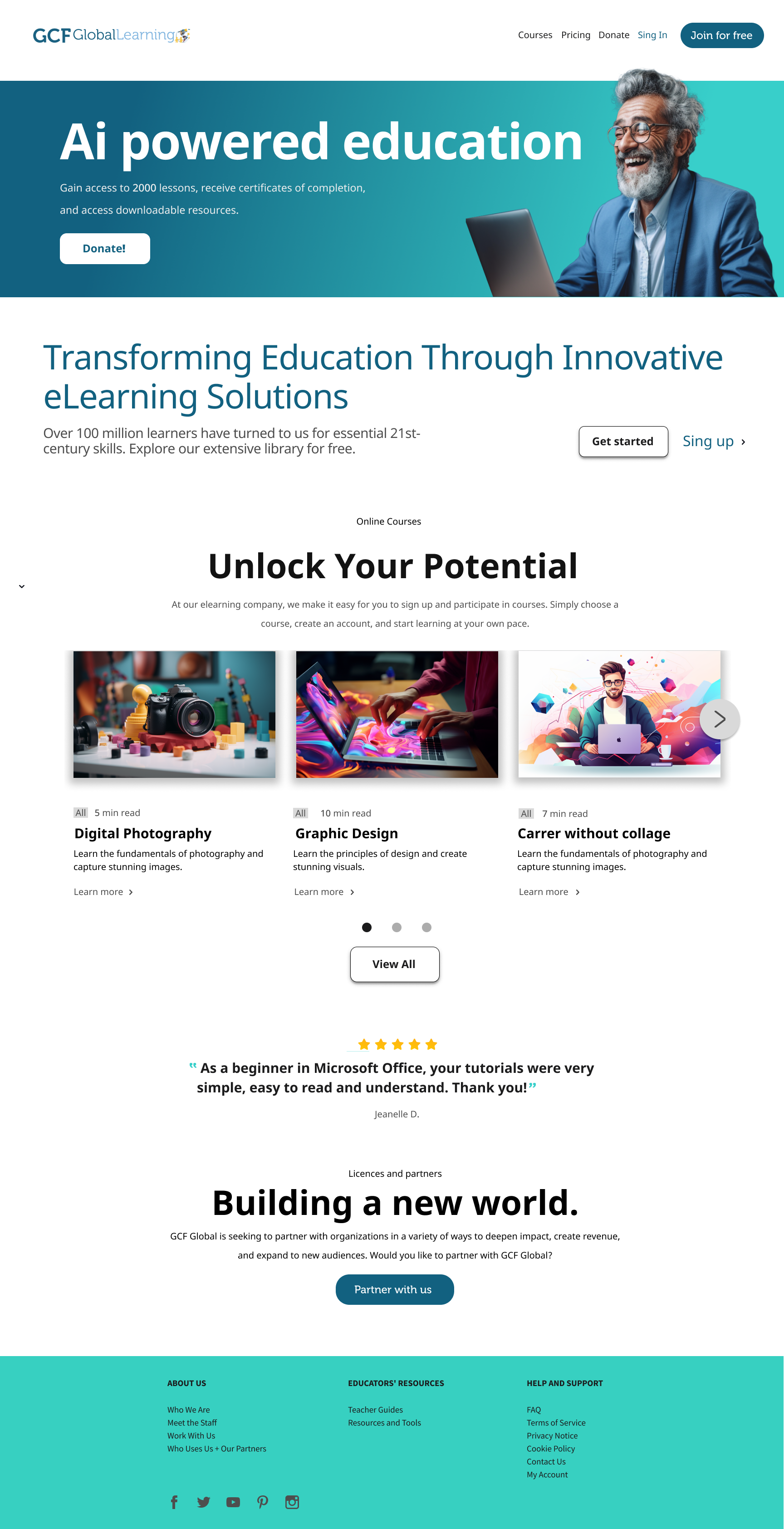
Original Website.
Wireframe
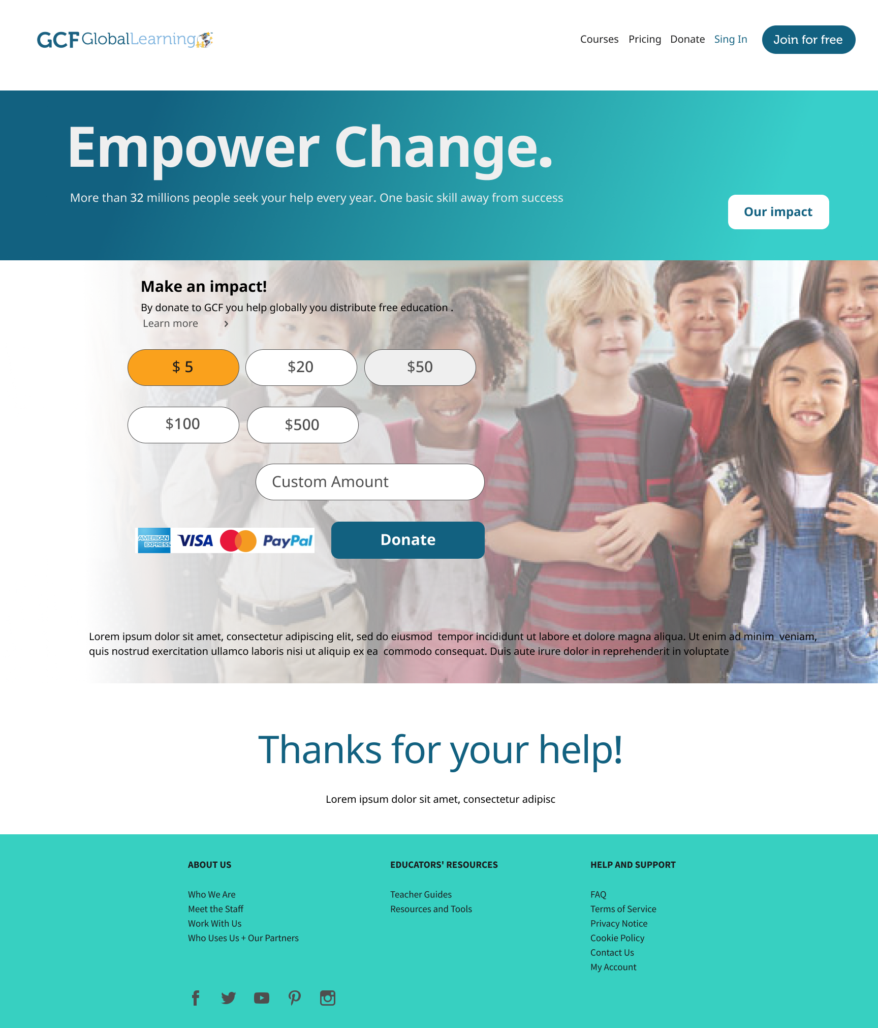
New design
New pages
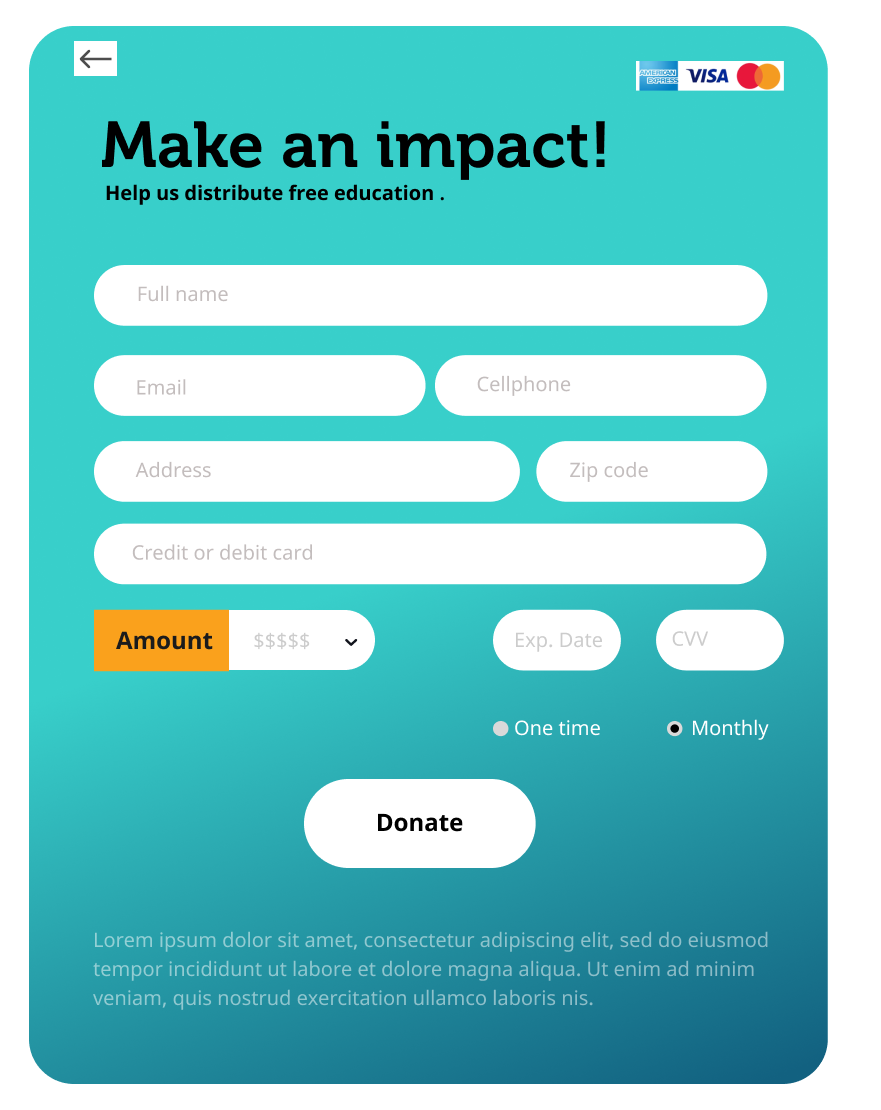
As part of the new directive for the non-profits, we needed to provide an option for online donations. I collaborated with management to propose a solution.
I created a visualization tool to display donation amounts, allowing the non-profit to engage with users effectively. Additionally, I designed the credit card checkout process.
